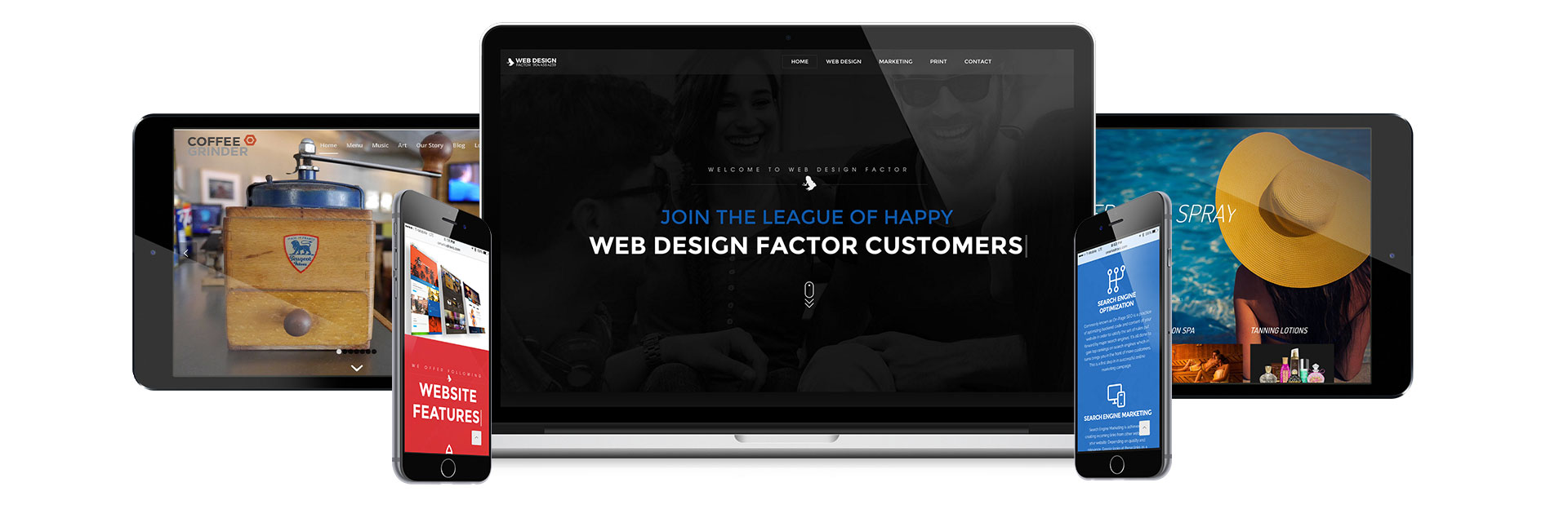
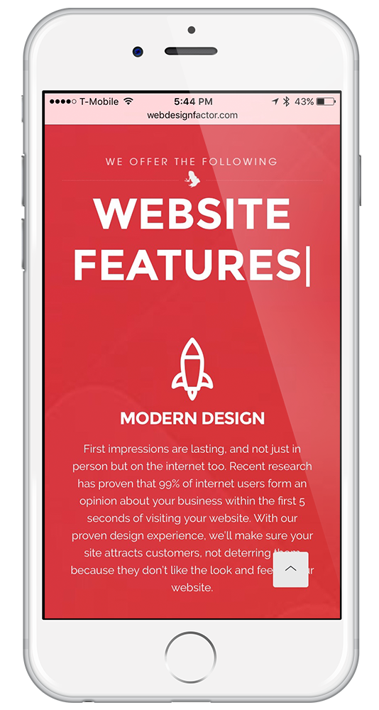
Responsive design allows your website to automatically transform it’s layout based on the screen size of the viewing device. The website will have the same information, but it’s elements (navigation, text size, images size and layout etc.) will adjust for the best viewing experience. Why is this important? Take a look at some of these stats below.
IT’S IMPORTANT TO KNOW
WHY MOBILE DESIGN?
0
%
Of all websites views are done via smart phone or tablet - Comscore
0
%
Of people will choose a different search result if the first is not mobile friendly - Skillcrush
0
%
Of mobile searches lead to an action within the hour, less than 10% on desktop - Skillcrush
0
%
Of people using mobile devices with a non-responsive website report having problems viewing the website.
SO YOU SEE...
Once the page loads users form an opinion about your brand within 1 second and you have 10 seconds or less leave an impression on them before they leave forever. This is why responsive design is so important. You don’t want them to use those 10 seconds struggling to pan, scan and zoom to find what they need.


LET THIS YEAR BE A YEAR TO IMPROVE YOUR BUSINESS
WHERE WOULD YOU LIKE TO GO NEXT?
START SOMETHING AWESOME
CONTACT US TODAY